Charting Shots Over Expectations
In statistics, an expectation is a way to quantify what is typical or likely. And, when we compare what actually happened against what was expected, we have a way to judge how surprised or unimpressed we should be.
Despite their usefulness, you are as likely to see a probabilistic expectation in tennis as you are a floral pattern at Wimbledon. Mainstream tennis stats only report what happened, not what was likely to happen. This is really too bad because it makes it makes it that much harder for fans to judge the quality of a player’s performance.
Consider Borna Coric’s upset of Rafael Nadal just a day ago at the Western and Southern Open. If we looked at the mainstream match summary for that win, we would learn, for example, that Coric won 73% of service points and 53% of return points; whereas Nadal won just 47% and 27% of the same points. This tells us how much Coric outperformed Nadal on each stat but it doesn’t tell us how much he might have outperformed his expected performance for the match, or how much Nadal performed below his expectations.
Accounting for Expectations
My last post suffered from the same problem. I presented a method for showing the frequency of serve locations for a particular plot using hexagonal binning with ggplot2. Using Roger Federer’s serves from the 2016 Australian Open, we found that his first serves are most often near the lines of the service box wide or down the T.
This information is useful by itself, but we might also like to know how different Federer’s patterns are compared to other players. In other words, how does Federer’s expected serve locations compare to a typical player on the ATP Tour.
So, in this post, I want to explore how to make a shot chart that shows frequencies above average. Here, “the average” Federer will be compared to are the serves of all other players at the 2016 Australian Open.
The first step is obtaining the hexagonal bins for each group. We can get the summary results for bins of a fixed width and height using the ggplot_build function. Below, using bins with a width and height of half a meter, we apply ggplot_build to Federer’s serves and all serves. The data element from this function contains a data.frame that has a summary of the center of each bin and the frequency of serves assigned to that bin.
gg1 <- ggplot(data = federer, aes(x = center_x, y = center_y)) +
  facet_grid(serve ~ .) +
  geom_hex(colour = "white", binwidth = c(.5, .5))

gg2 <- ggplot(data = atp_serves, aes(x = center_x, y = center_y)) +
  facet_grid(serve ~ .) +
  geom_hex(colour = "white", binwidth = c(.5, .5))

federer_data <- ggplot_build(gg1)$data[[1]]
tour_data <- ggplot_build(gg2)$data[[1]]
The next stage is to compute percentages for each bin, which is what will be used to summarise the expected location for a serve of Federer’s versus the expectation for a serve of an arbitrary tour player at a Grand Slam. This is done below by the Panel factor, which is an indicator for first or second serves in this example.
federer_data <- federer_data %>%
  group_by(PANEL) %>%
  dplyr::mutate(
    percent = value / sum(value)
  )

tour_data <- tour_data %>%
  group_by(PANEL) %>%
  dplyr::mutate(
    percent = value / sum(value)
  )
Now, we are ready to the merge the bins together. This is the tricky part, as we don’t want to require an exact match of locations. Instead, we right a function that looks to see if each center of a tour bin is within the bin region of Federer’s servers. If it is, we assign that to the same center of Federer’s matching bin, which will allow us to easily merge the serves by their location. Here is what this looks like.
for(i in 1:nrow(tour_data)){

  matching_bin <- tour_data$PANEL[i] == federer_data$PANEL &
    tour_data$x[i] >= federer_data$x - .25 &
    tour_data$x[i] < federer_data$x + .25 &
    tour_data$y[i] >= federer_data$y - .25 &
    tour_data$y[i] < federer_data$y + .25

  if(any(matching_bin)){

    tour_data$x[i] <- federer_data$x[which(matching_bin)[1]]
    tour_data$y[i] <- federer_data$y[which(matching_bin)[1]]
  }
}


combined <- merge(federer_data, tour_data, by = c("PANEL", "x", "y"), all = TRUE)
combined$percent.x[is.na(combined$percent.x)]  <- 0
combined$percent.y[is.na(combined$percent.y)]  <- 0

combined <- combined %>%
  group_by(PANEL, x, y) %>%
  dplyr::summarise(
    percent.x = sum(percent.x),
    percent.y = sum(percent.y)
  )

combined$diff <- combined$percent.x - combined$percent.y # How much more frequent than Federer
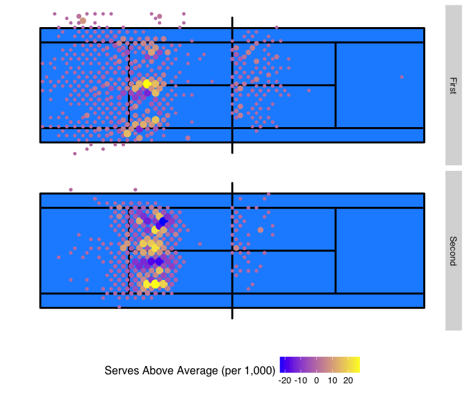
Once all of this is completed, we are able to put together a plot. In this case, I’ll use a simple geom_point with a gradient by the relative difference, diff. The diff is multiplied by 1,000 so that the counts shown represent what would be expected out of 1,000 serves of Federer compared to 1,000 serves of a typical tour player.
The result highlights that Federer’s tendencies on the lines are surprising when compared to other players, even those who are competing at a Grand Slam. On first serve, Federer’s down the T frequency is unusually high. We also see that the frequency of the corner wide shots to the Deuce court are more likely than what is typical for other players.
The second serve patterns are particularly interesting. When we previously looked at Federer’s serves alone, it seemed that the serves were more shallow and to the center of the court than on the first serve, but otherwise looked uniform across the width of the service box. Now, when compared to the general second serve patterns of the tour we see that he is still hitting the lines more than other players.
ggplot(data = combined, aes(x = x, y = y)) +
  facet_grid(PANEL ~ ., labeller = labeller_function) +
  geom_rect(aes(xmin = -11.89, xmax = 11.89, ymin = -5.49, ymax = 5.49), fill = '#1e90ff') +
  geom_path(data = court_trace, aes(x = x, y = y), color = "black", size = 1) +
  geom_point(aes(colour = diff * 1000, size = abs(diff))) +
  scale_colour_gradient(name = "Serves Above Average (per 1,000)",
                        low = 'blue', high = 'yellow', breaks = seq(-20, 30, by = 10)) +
  scale_y_continuous("", lim = c(-7, 7), breaks = NULL) +
  scale_x_continuous("", lim = c(-12, 12), breaks = NULL) +
  theme_hc() +
  theme(legend.position = "bottom") +
  scale_size_continuous(range = c(1, 4), guide = FALSE)
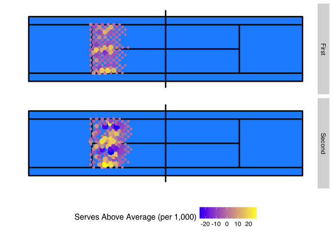
The next plot repeats the same steps but now restricts the pattern to all good serves. This makes Federer’s ability to hit lines on the first and second serves even more apparent.
Summary
Statistical expectations help to give context to performance patterns. In this post, I have shown a simple version of an expectation that compares serve location pattern against the tour average and how it can be plotted as a shot chart. Just as this comparison provided some new insights about Federer’s serve accuracy compared to other tour players, better contextualizing of other performance stats would likely have similar advantages.