A How-To Guide for Tennis Rally Animation
With modern tracking data, it is possible to get an almost continuous representation of the locations of both the ball and players during a tennis match. The richness of these data is a huge boon for tennis research but it comes with some challenges too. A lot of my time these days is spent thinking about how best to visualise this information.
Because time and flow are inherent parts of tennis data, animation is a natural choice for visualization. Animation effectively allows us to create movies of tennis tracking data. The potential benefits of applying animation aren’t new. Hans Rosling, who sadly passed away last month, spent much of his career promoting the use of animation to bring statistics to life, work he talks about in several popular TED talks.
Although in the past one might have needed some heavy duty software for stringing interesting plots together in time, things are much easier today. For example, just a couple tools in R can do the trick (more on this in the video below).
After stumbling on a Revolution Analytics' post showing how to animate NBA plays using SportVU data, I wanted to do the same for tennis. As that post showed, it is pretty straightforward to combine ggplot graphics with gganimate to create animated GIFs or videos of tennis rallies.
Below is a result of my attempt to plot one of the points from the critical hold of Mischa Zverev in the sixth game of the 3rd set in his eventual upset over Andy Murray at this year’s Australian Open. A video animation of the full game is available here.
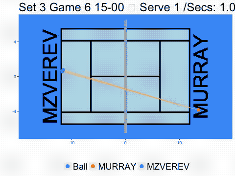
This representation of the point looks like an early arcade game like Pong. But it actually gives a good impression of the reality of the benefits and limits of current tracking data. It gives you a continuous representation of ball and player position, which can be used to calculate speed and distances, but it doesn’t tell you about how players are positioned or other attributes of a shot like spin (though you can try to estimate these things).
Still there are a whole range of questions we could start to answer with even this fairly basic data. For example, what are the most common spatial orientations between players? I’ve tried to highlight the space between players above with the shaded region. It is interesting to think about how concepts like “effective player position” or “court real estate” could be investigated with these data. If nothing else, this simple replay tool should convince us to look at the game in different ways, as it can lead to ideas about the inner workings of tennis that we wouldn’t have had otherwise.