Shot Quality Maps
Imagine you could measure the quality of every shot during a tennis match. What would it reveal about a player’s performance and where on the court they perform best?
In tennis, we focus a lot on the final shot of a point. These shots get special labels— winner, unforced error, and forced error— and their own set of statistics as a consequence.
The obsession with the ‘final shot’ is a bit strange when even causal fans will tell you that a point is often decided before the last shot. A server might set themself up for a winner by making a strong serve, for example, or a player can setup a blazing down-the-line shot by first pulling their opponent off court with a effective crosscourt groundstroke.
The attention the final shot is paid is really a matter of convenience. If we had a way to label every shot as ‘amazing’ or ‘poor’, we would do this all the time. Thankfully, with modern prediction models scoring the quality of every shot is now a reality.
In my role at the Game Insight Group (GIG) at Tennis Australia, we have developed prediction models for the probability that any serve or groundstroke shot will end in a winner. These build on the award-winning paper presented at the 2016 MIT Sloan Conference and one application of the predictions were recently featured in a piece by Christopher Clarey on trends in men’s 2nd serve.
What is really cool about these models is that they provide an accurate measure of a shot’s quality for every shot in an exchange. Quality in this context is how similar a shot’s characteristics are to shots that have historically been clean winners.
This measure of shot quality has a lot of potential to provide more interesting analyses of the game than we are used to. I thought it would be fun to highlight a few of these by presenting some shot quality charts for the men’s Australian Open final.
Shot Quality Map
The first chart shows the groundstroke locations for all shots in play in the men’s final. The shots are separated by backhand and forehand with Federer’s shots on the left and Nadal’s shots on the right.
Colors in the chart highlight the shot quality. The closer to gold in color, the better the shot was using our ‘winner probability’ metric.
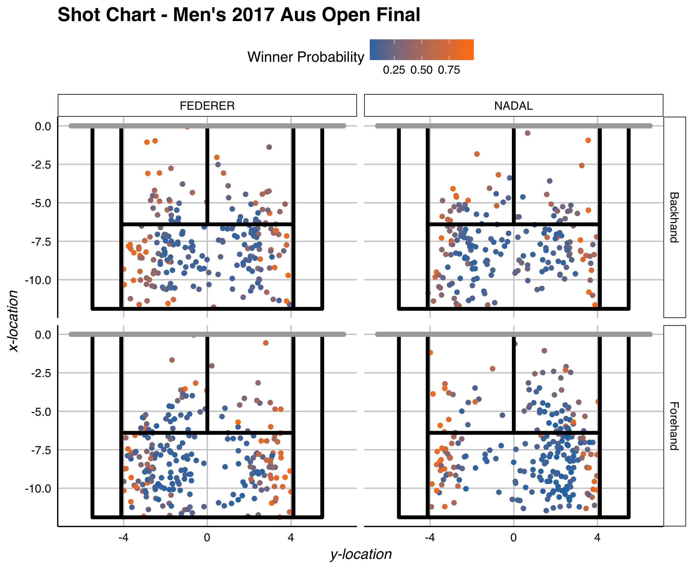
Both players show sweet spots nearest to the lines of the court. Interestingly, even short shots that are near to the sidelines can be a high-quality shot. On the backhand, Federer shows a similar balance in quality on the Ad and Deuce sides of the court, whereas Nadal appears to be slightly more effective on the Deuce side. On the forehand, Nadal has a greater density of shots to the Deuce-side but tends to be more effective per shot on the Ad-side. That pattern is largely flipped for Federer’s forehand.
Speed and Accuracy
The trade-off between speed and accuracy with shot quality is one of the more interesting questions in tennis. In the second chart, we plot speed against the nearness to line and highlight where winners tend to be more prevalent.
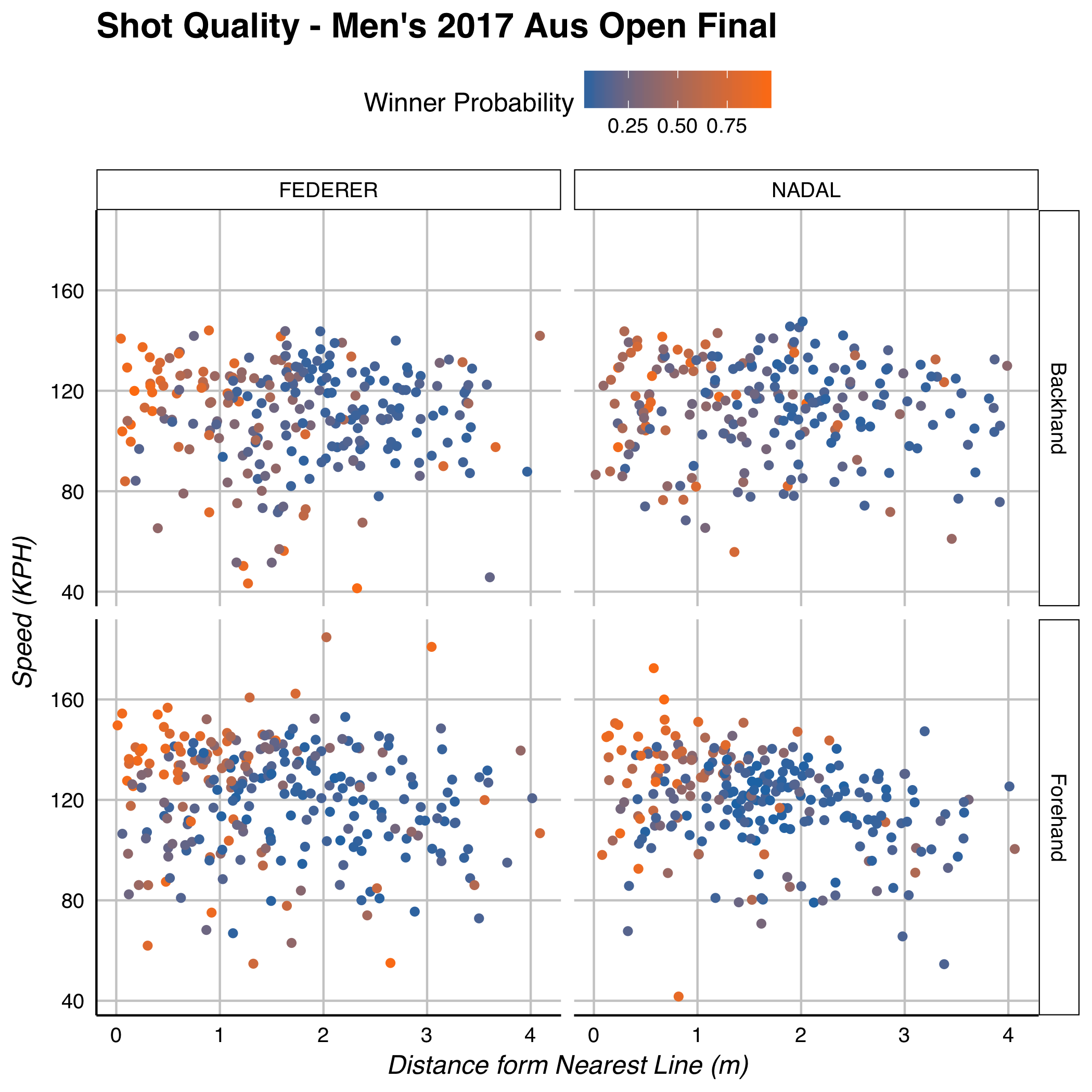
The zone within 1 meter of a line is where the highest-quality shots tend to exist for groundstrokes. Federer and Nadal have a similar range in speed on the backhand, though Federer achieves a higher quality of shot in the 1m zone. On the forehand, the quality is quite comparable for both in this region, with Federer having more high-quality shots on the forehand beyond the 1m range.
Shot quality is a useful new statistic for tennis. Although we are only now beginning to explore what it can tell us, it is already clear that it will be able to enrich our analysis of the game.