Which Set Scores Are Most Likely for all Combinations of Servers?
In her debut match after nearly 8 years out of professional play, Kim Clijsters impressed many by taking Garbine Muguruza to a second set tiebreak. Neither player was winning more than 60% of points on serve, which made me wonder how likely a tiebreak was in this case. In this post, I use a simple Monte Carlo model to examine the most likely set scores for a variety of server matchups.
When Clijsters made another return to tennis at this week’s Dubai Championships, many marveled at the scoreline of a match against a player who was just coming off of a finals run at the Australian Open. Though commentators often treat tiebreaks as examples of two players who have essentially performed equally in a set, there are many situations that can result in a tiebreak and not all are ones when both players have performed equally well.
In her second set tiebreak over Muguruza, for example, Clijsters and Muguruza exchanged two breaks of service each and Clijsters won just 52% of points on serve while Muguruza won 59%. Looking at those stats, I couldn’t help but wonder whether Clijsters got a bit lucky in having such a close set?
Using a simulation of a tennis set, I looked at the chance of every set score line for a variety of player matchups. In each case, I assume that a player’s win percentage when they serve is constant throughout the set. This is a simplification (the “iid” assumption in tennis), but it a useful baseline and, it also turns out to be reasonably close to how most players perform in any one set.
The chart below is a heat map of the results. The set winner’s serve strength is along the y-axis and the loser of the set along the x-axis. Each panel corresponds to a different final set score for the losing player or a probable tiebreak, if that is reached. Summing up all cell’s in the same spot of the grid across the 7 panels gives a total of 100.
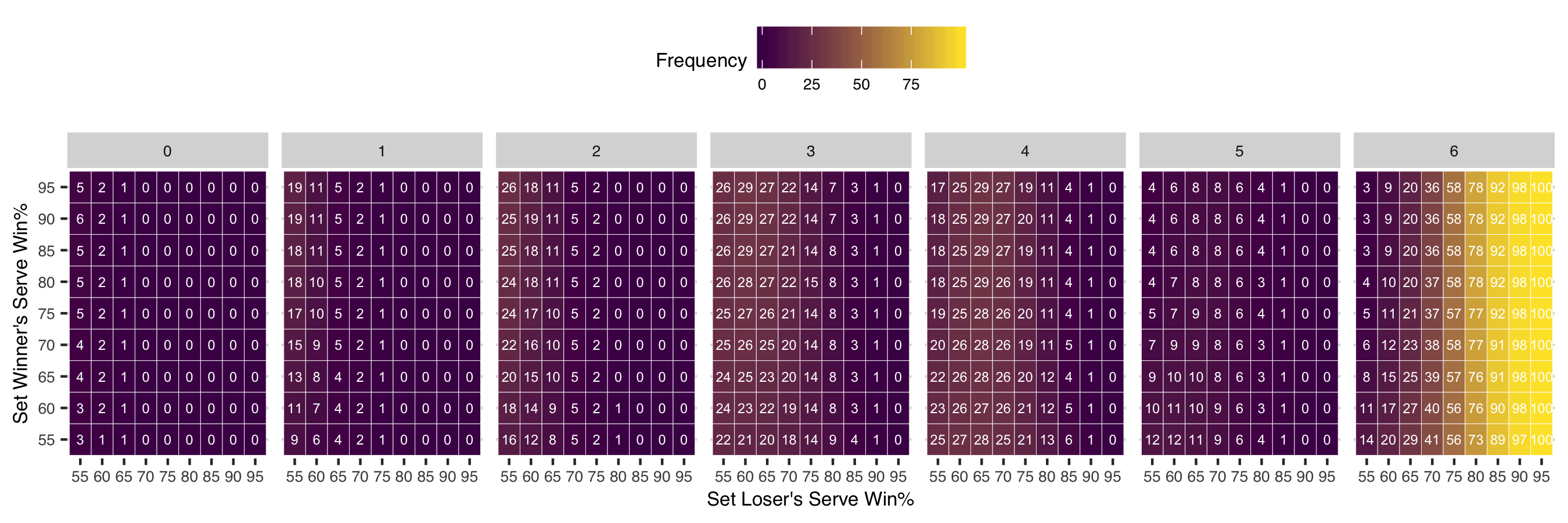
So, if we look up a 55% along the x-axis and 60% along the y-axis, we see that a tiebreak had just an 11% chance in the case of the Clijsters and Muguruza second set in Dubai. A more likely score with those serve numbers, in fact, would have been for Muguruza to take the set 6-4 or 6-3.
Why is this?
Well, we can see by scanning the chart from left to right, that tiebreaks become more likely when players are serving more similarly, a small “malus” in the terminology of Klaassen and Magnus. The malus, in the chart below is 0 along the diagonals and grows the further you go off the diagonal.
But the closeness in serve isn’t the only story. The most important factor, in fact, is the overall strength of serve between both players, which can be summarized by the combined serve win percentage of the players. This is known as the ‘bonus’ by K&M. For the Clijsters and Muguruza set, for example, the bonus was just 111, which is rather low for elite tennis. The bonus in the chart above, is highest as you move upward (for the winning player) and to the right (for the losing player).
When we fix any row in the chart, we see that the chance of a tiebreak, or getting to the last panel to the right of the chart, in this case, increases the stronger the losing player’s serve performance was. It would be very surprising for a player who is winning 95% of points on serve to lose but, if it did happen, it is almost certain to happen in a tiebreak.
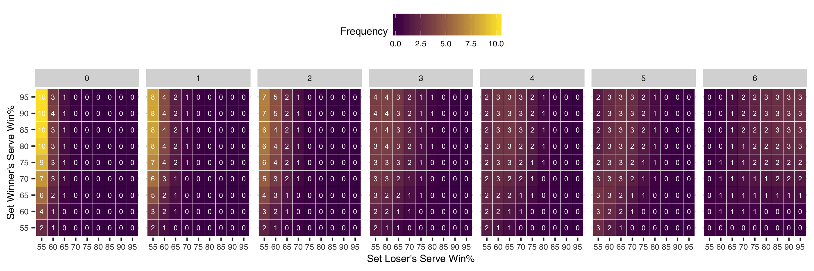
We can also condition on the score rather than the server performance of the two players. What this means is that we look at how likely the combination of serve win percentages are given that the set ended 6-3, for example. In the case of a tiebreak, we see a greater concentration of the probability in the high bonus top right corner. The probabilities look quite uniform in this range, which emphasis that players do not have to be performing equally to produce a tiebreak.
One of the things that makes tennis such an appealing sport to analyze is how much we can learn about the likely results of matches by just knowing how two players perform on serve against each other. In a single chart we’ve captured nearly all the possible outcomes of sets we will see in professional tennis! Obviously, we can also incorporate non-iid effects if we knew that players systematically choked on break points, for instance, but I hope this is a useful reference for tennis fans who want to go beyond box scores.