More Exploration on Using Match Stats to Classify Playing Styles
Last week, I looked at whether basic match stats, like aces and minutes played per point, could help describe a player’s playing style. In this post, I expand on the set of style features and delve into the clusters of playing styles they reveal.
In my previous post, I did a small experiment with two player effects to see their potential to define different types of playing styles. The effects were a player’s ace rate and minutes played per point compared to the average player, estimated from a hierarchical model with player random effects. The results were promising, with the clusters separating well-known big servers from strong defenders, for example.
But aces and point duration aren’t likely to describe all the facets of playing style that match stats could. After some more thought and comments from tennis stats heads on twitter, I decided to add the following to the list of style features:
-
Double fault rate. This should highlight players who take a lot of risks on serve as well as players who are mental basket cases on serve.
-
(First serve won - Second serve won). Most players can be expected to take a hit in points won on serve when they have to go to a second serve. How much of a difference there is could highlight the second serve technique and how much their offensive ability depends on the brute power of their serve.
-
(First serve won - Return points won). If first serve won is a measure of a player’s overall strength on serve— combining the technique on the serve itself, third shot strategy, and rally ability— and return points won is a measure of defense ability, then this difference should help determine a player’s balance of offensive and defensive ability.
While I considered additional measures like a winner-to-error ratio or rate of net approaches, it looked like I could only get these for multiple years at Grand Slams. Given the infrequency of net points and the instability of error classifications from one event to the next, I don’t think player effects will be reliable if these are limited to matches at Majors, so I am setting those possible style features aside for now.
Before throwing these features at a clustering algorithm, we want to first understand what they are like and how they relate to the other features. A pairwise scatterplot can help us do just that. Here is what we would find for the effects for ATP players, for player appearing at slams, based on all tour matches played from 2017 to the present. For this initial analysis, all surfaces will be considered together.
All of the effects are on a standardized scale, resulting in effects that are centered around zero and range from -5 to +5, for the most part. There are several pairs of the features with moderate to strong positive correlations. The strongest is between the ace rate and the first won to return points won difference, which suggests that a power serve might drive above average values for the latter metric. Because of the tightness in the relationship for these two, I will drop the difference in first won and return points won, so that serve power isn’t over-represented in the characterization style.
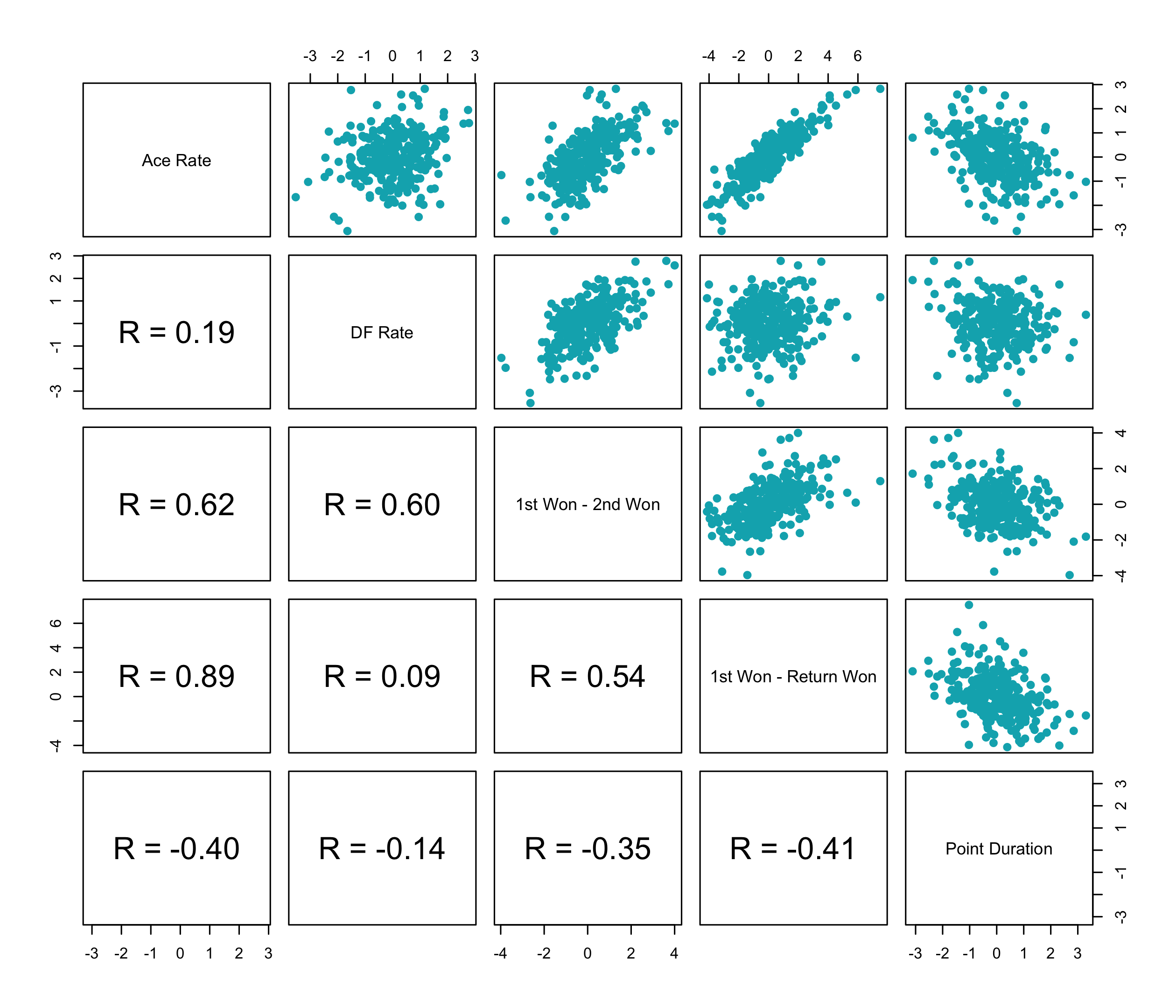
Interestingly, we see a similar correlation between the double fault rate and the difference in first and second points won but not the difference in first won and return points won. This suggests that double faults can help to get at decision-making and strategy on second serve that wouldn’t otherwise be captured by any of the other features.
As we might expect, given the emphasis most of the features have on aspects of serve, point duration has either no or a negative correlation with the rest of the style features.
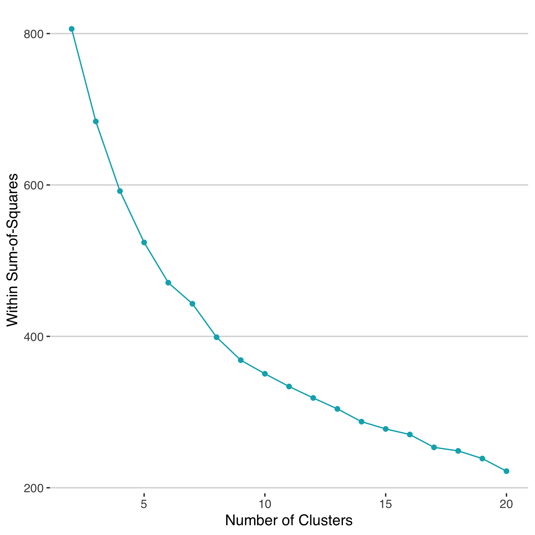
With this slightly larger set of features, we can cluster using the same k-means approach as before. The total within sum-of-squares suggests that 10 clusters would be a reasonable choice for this sample of players.
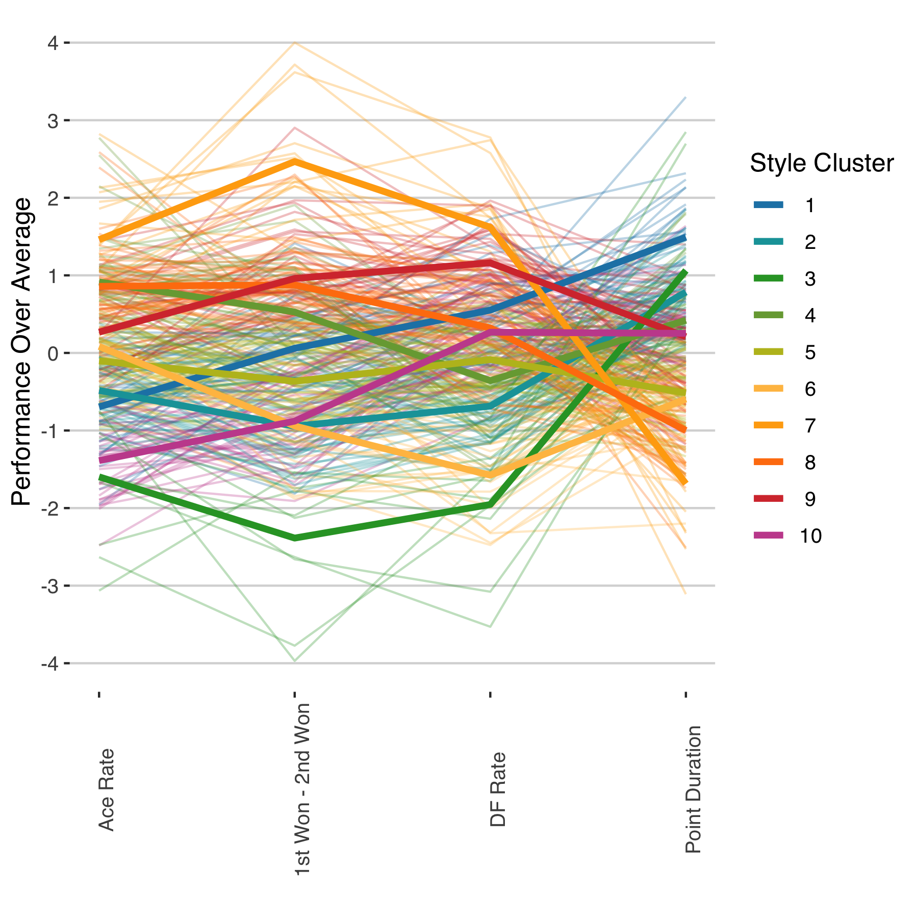
With just four features, the differences between the style clusters can be readily visualized with a parallel coordinates plot. Each color in the plot below denotes a distinct color, the larger lines representing the mean for the cluster. One thing that stands out immediately from this chart is the large amount of variation between clusters on the gap between first and second percent won, which does more than any other single variable to separate clusters. Point duration, on the other hand, shows that least cluster-to-cluster differences among the style features.
There are more than 250 players in the sample, making it difficult to show each player’s style cluster in a compact way. We can pick out the 3 most representative of each cluster by finding the 3 whose performance effects are nearest to the cluster’s centroid. This will give us some idea of whether the clusters Those representative players are shown for each cluster below. The percentage of players falling into each ranges from 3% to 15%, cluster 3 being the least common and cluster 8 the most common.
| Cluster | Percent | Three Representative Players |
|---|---|---|
| 1 | 8.2 | Taro Daniel, Paolo Lorenzi, Andy Murray |
| 2 | 11.7 | Adrian Mannarino, Gilles Simon, Mitchell Krueger |
| 3 | 3.4 | Roberto Bautista Agut, Pablo Carreno Busta, Mikhail Kukushkin |
| 4 | 12.0 | Stefano Travaglia, Stefanos Tsitsipas, Steve Johnson |
| 5 | 14.4 | Ruben Bemelmans, Peter Polansky, Bjorn Fratangelo |
| 6 | 7.9 | John Millman, Philipp Kohlschreiber, Tim Smyczek |
| 7 | 4.8 | Peter Gojowczyk, Benoit Paire, Sam Querrey |
| 8 | 15.1 | Lucas Pouille, Daniil Medvedev, Gael Monfils |
| 9 | 10.7 | Fernando Verdasco, Grigor Dimitrov, Denis Shapovalov |
| 10 | 11.7 | Radu Albot, Thomas Fabbiano, Diego Sebastian Schwartzman |
Whether these clusters have a real use comes down to their predictive value. If they can tell us something about performance outcomes that isn’t already explained by the overall ability of players (as captured by their official ranking or Elo rating) it would mean there could be hope in adjusting for matchup effects without head-to-head. This will be the central question I’ll turn to in my next post.