Who's Got the Power? - Classifying Speed Styles on Serve
A recent data feature on the ATP website gives us insight into the average speeds of shots at more top events than just the Grand Slams. What can these speed stats tell us about a player’s style? In this post, I look at the speeds on first and second serve and use a mixture model to identify the different power styles that are used by today’s top male players.
If you have watched any of the first 10 days of the 2020 French Open, you will have likely noted that the picturesque clay courts have been framed, with all the elegance that we expect of RG, by multiple advertisements for the company Infosys. This is just the most recent sign of Infosys’s increasing presence on the screens and websites at tennis events. Over the past 3 years, this IT corporation has secured data partnerships with the Australian Open, Roland Garros and the ATP Tour and taken over some aspects of the digital platforms of each.
Although these partnerships have seemed to largely been a branding exercise for Infosys, there is at least one development that is a boon for tennis analytics. Starting in 2018, as part of the Infosys-ATP partnership, the ATP website includes ‘second screen’ feature with match results that has a number of statistical summaries derived from Hawkeye tracking data. This is big deal because, although the data is highly aggregated, it is still the only public source of positional data for matches outside of the Grand Slams.
Despite the tech acumen of Infosys, the feature is surprisingly hard to navigate to from the ATP’s main site. If you want to see what is there, your best bet is to start from the Results Archive, select the event of interest and look for the 2nd link. The availability of the feature is a bit spotty, covering a few events in 2018 and most Master and 500 events starting in 2019.
Two stats included in the second screen summaries are the average speed on first and second serve. These aren’t the most revolutionary of data points, as serve speed has been regularly reported at Grand Slams for a number years. But having these stats for more matches over the season opens up gives us a more robust look at a player’s tendencies and how they might change over time and with different match conditions.
For now, I am going to focus on one very basic (and very statsy) question: How can we describe the probable outcomes of a player’s power on serve for any given match?
Obviously, we need a model. But what model would give us a good description of the average match serve speeds? Let’s have a look at the characteristics of the speeds in our match sample and see what that suggests.
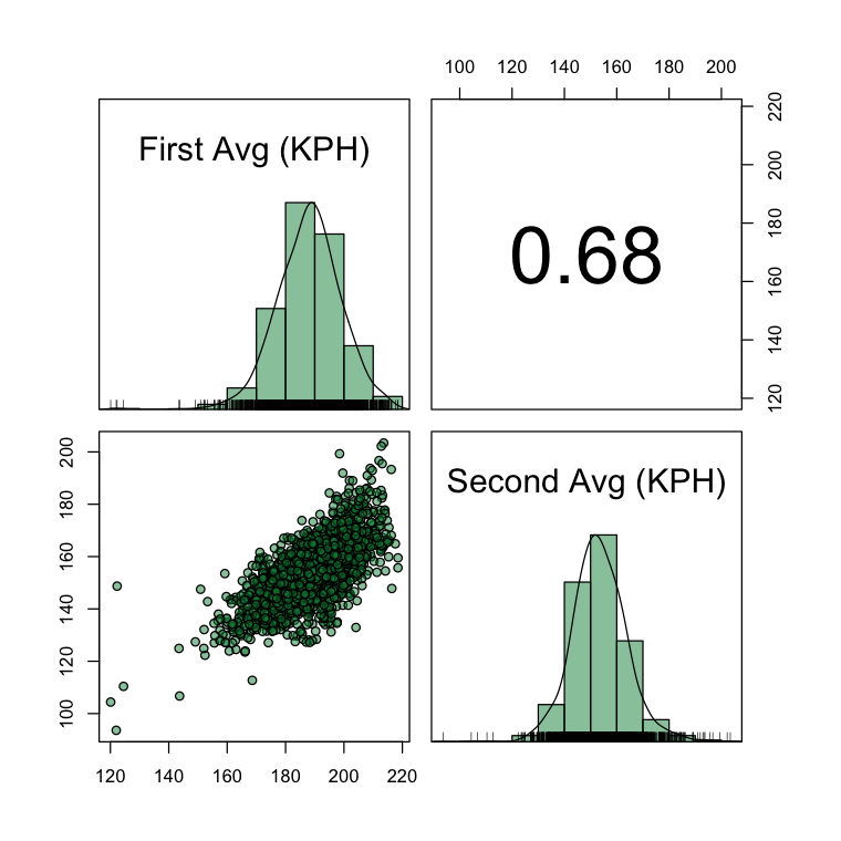
Below, we see all of the match summaries I managed to scrape from the 2nd screen feature of the ATP website. Each point in the scatterplot here represents one match and server. The first serve speeds have an average of 188 KPH and SD of 11. Although the empirical distribution is fairly normal, there is a pronounced left tail with a subset of matches having average first serves speeds of 160 KPH or less and a small number with averages of 125 KPH or less. That last group made me suspicious about some error in the data. Three matches in that group were all from the 2018 Indian Wells, with serve performances for Diego Schwartzman, Hyeon Chung, and Dusan Lajovic. None the biggest hitters in the game, but I can’t imagine any of them would be averaging a first serve speed that even I might have a chance of returning.
I have developed an outlier score to try to flag these weird cases. But there is no smoking gun for an error in these data. So, for the purpose of this analysis, rather than exclude suspicious cases entirely with some ad hoc rule, I am going to leave them in and look for a model that will do well in the presence of possible outlier matches.
So back to the general characteristics of our serve data. We see that the second serve speeds are quite close to a bell curve in shape, with a mean of 153 KPH and SD of 10 KPH. The scatterplot in the bottom corner shows a tilted ellipse, reflecting the rough normality of each variable and the strong positive correlation between them.
Taking all of this together, we could consider a bivariate normal distribution, which give us the approximate shape of the joint distribution of speeds and the tendency for servers with greater than average power of the first serve to have greater than average power on the second. But a simple bivariate normal would account for the asymmetry in the data and heavier-than-normal tails, a small number of which might be due to errors in the data collection but a larger number that could be due to differences in player serve styles, strategy, or match-to-match conditions like the a blustery day in Paris, for example.
A better option is a normal mixture model. The idea with the normal mixture is to suppose that there are $K$ unknown ‘power types’ for the pair of first and second serve outcomes— these could correspond to styles or different levels of power depending on a player’s build or anything we can think of that would account for systematic differences in the location and scale among serve performances.
If we knew which $k$ group a server’s match performance was in, we would model it with a $D=2$ dimensional normal distribution, having its own mean ($\mu_k$) and covariance ($\Sigma_k$),
$$ Y_D | k \sim MVN_D(\mu_k, \Sigma_k) $$
But what do we do about this unknown $k$? How can we model what we don’t observe?
Well, this is where the strength of the mixture model comes in. And we actually have a number of options here but the most basic one is to assume the total number of components, $K$, is known. If we can do that, then likelihood principles will do the rest in finding the individual bivariate normal that provide the best description of the data. In the Bayesian setting, in addition to the standard priors for the hyperparameters, we would need a distribution for the mixture components. Since we can think of these components as latent subgroups, all we need is a distribution for the probabilities of the frequency of each type,
$$ \lambda \sim Dirichlet_K(\alpha) $$
The Dirichlet is a common choice for a simplex variable, which is exactly what we want for the mixture weights, $\lambda$.
One of the advantages of using a Bayesian approach is that we can easily incorporate additional information about the groups. If for example, we knew that players over 6ft 3in always serve over 188 on the first serve, it might be reasonable to build this into the component-specific hyperparameters. For this post, however, I am going to take a non-informative approach for all priors.
I’ve been using stan for most of my modeling in the last year. It is a great option for a lot of problems. For mixture models, I really appreciate how easy it is to apply a basic framework to different likelihoods, like adapting a finite mixture of normal data to count data for instance. The other thing that is a massive help are a number of highly-efficient diagnostic and model selection tools that the stan developers have made it easy to use with very little extra work for the modeller.
To see what I mean, I’ve put the full stan model code for the serve speed bivariate normal model at the end of this post. In this model, each match of T matches is structured in an array y, having a vector of first and second serve speeds for each element.
The LKJ-Cholesky is used for a more efficient implementation of the multinormal model. The priors are otherwise standard non-informative choices.
Looking at the model block, you may be wondering where the draws for the $k$ group assignments are? Well, we don’t draw those directly. In fact, we couldn’t sample them even if we wanted to in stan. Instead, we use the marginalized likelihood, by taking the weighted sum of the component-conditional observations, weighted by the component weights $\lambda$. This is collected in the lp variable for all match outcomes and added to the target posterior.
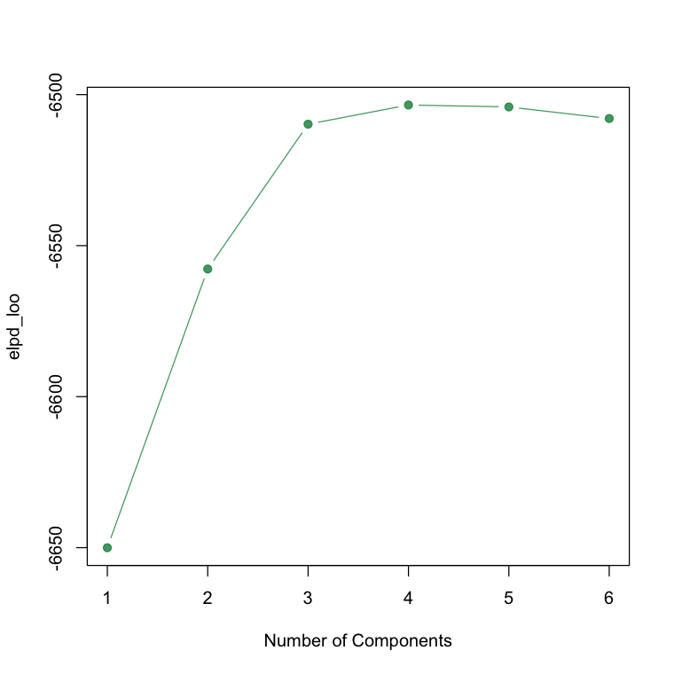
The last section of the code is the generated quantities block. This section of the code has no influence on the model’s sampling (that is, the fit of the model). But it is essential for our diagnostics and for some convenient summaries of the model results. Specifically, the loglik variable is going to be what we will pass to the loo package and use to calculate the expected log predictive density for different values of $K$, choosing the number of components where the predictive performance of the model first levels off. The other part of this section are the z variables, that is the posterior draws from the component distribution that gives us the most probable serve type assignment for each observation.
I ran the model using the variational inference method for $K=1,\dots,6$. You can see from the ELPD plot above that there is little predictive improvement after $K=3$, so that is a clear sign that three components are a sufficient description of the serve speed data.
With a bivariate outcome, it is easy to summarize how the components differ by generating samples from each and visualizing them in a scatterplot. Those distributions below show us the Component 1 represents the average server, where first serve speeds are close to 188 KPH on average and second serve speeds are strongly correlated with the first.
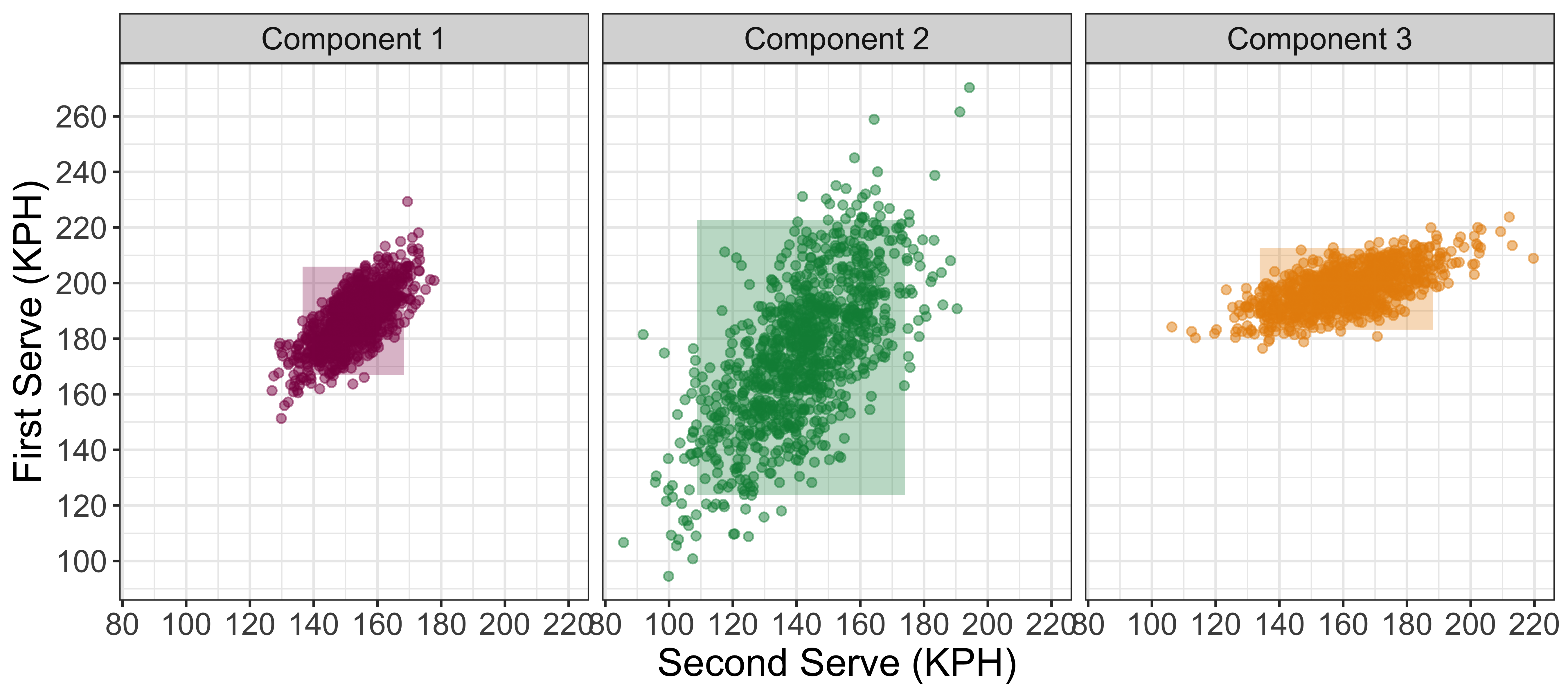
Component 3 is a big server component, where the first serve speed average is closer to 200 KPH. Interestingly, the serves in this group show a weaker correlation between first and second serves, as we can see a big range of second serves are possible for each value of first serve speed in the center of the distribution.
Finally, Component 2, with extremely greater variance than either of the other serve components, appears to be a catch-all for strange serve performances. This could include those slow first serve speed matches discussed above, as well as some performances with extremely strong first serve performances, or strange combinations of first and second serve.
One of the fun things we can do with this model is to look at differences in the mixture representation for specific servers. We can do this by drawing the posterior samples of the mixture component z for each match, and then summarize the distribution of the mixture components across a player’s matches. The heatmap below shows the posterior mean probability of each component for 50 top servers, sorted by the frequency of Component 3 (our mixture for big first serves).
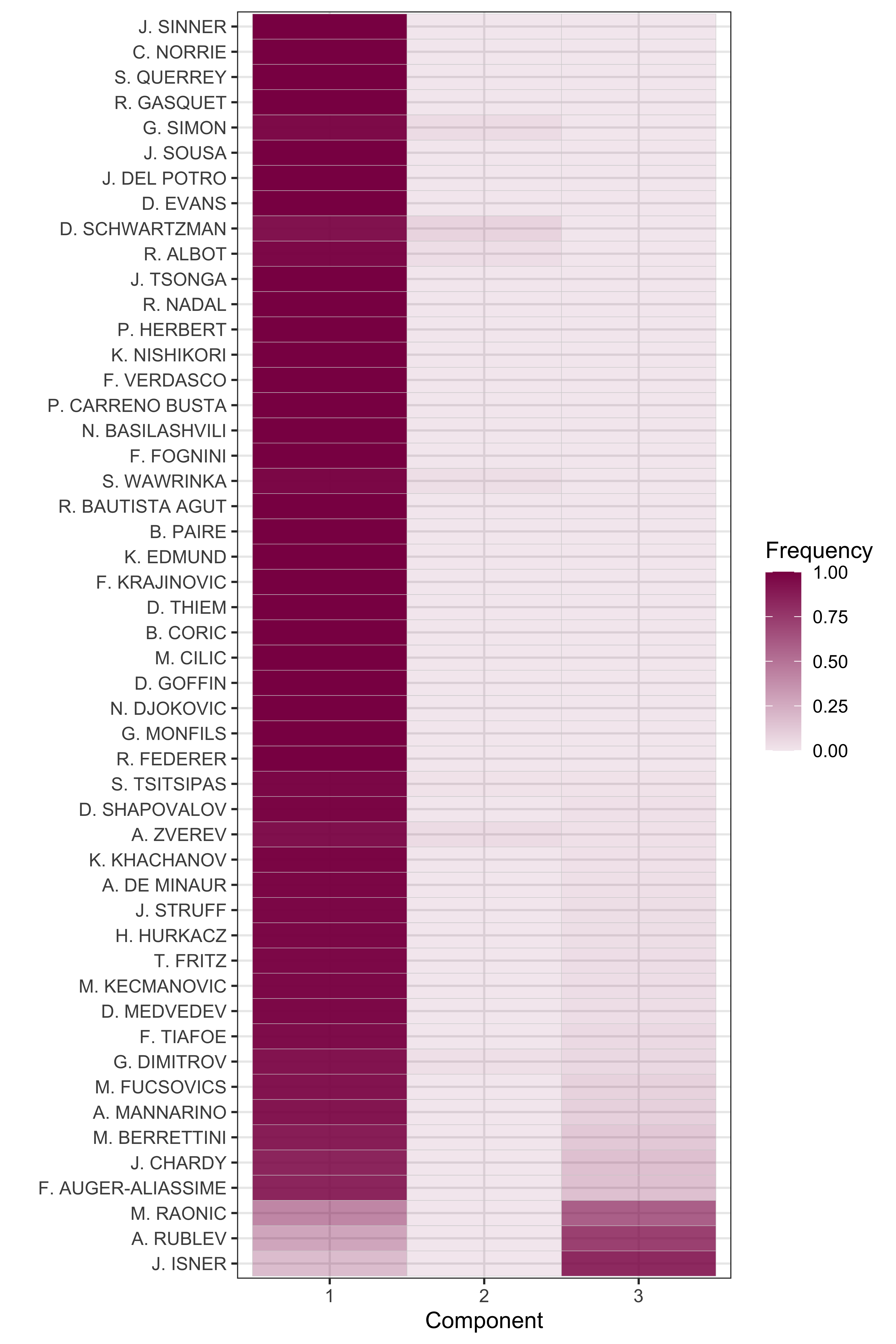
As we might expect, Component 1 describes the match performances for most players. However, there are a number of players whose serve performances in some matches are most consistent with Component 3. More than 50% of the serve performances of John Isner, Milos Raonic and Andrey Rublev are in Component 3. The weight of Component 3 appears to be related to player height, with Rublev (a 6'2'') having the most power per inch of any of these players.
Although more difficult to see, we can see a few players with more than zero probability for the weird Component 2. Alexander Zverev and Diego Schwartzman are too examples, which looks really surprising given that the serve speeds of these players have little in common. What could be going on?
Below is a plot of these players and several other interesting comparisons that shows the mixture component for individual match performances. The Component 2 performances for Zverev are two matches with first serve speeds averages around 220 KPH and average second serve speeds of 140-150 KPH. These land in Component 2 because the other components would have expected much higher second serve speeds with that kind of power on the first.
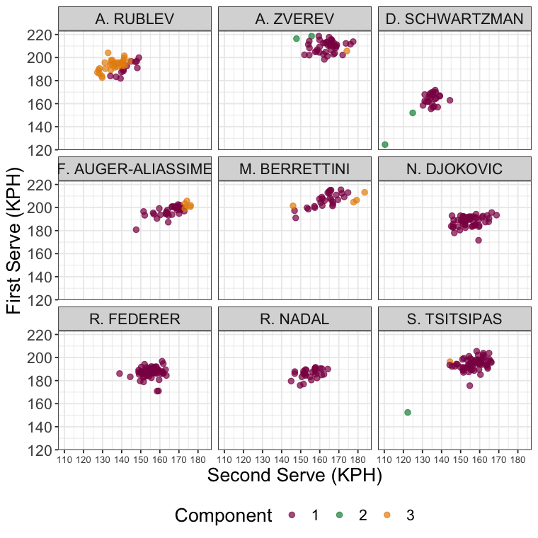
For Schwartzman, the Component 2 cases are two matches with speeds on the first and second serve that are way outside the norm for either Component 1 or 3. So, two serves with similar weight on Component 2 doesn’t mean their serve speeds are similar, just that they are similarly unusual.
It is a similar thing with Rublev. When we see the breakdown of his match performances and their mixture assignments, we see that it isn’t simply that he is serving like ‘Isner’. No, the heavier weight on Component 3 has more to do with having above average first serve speeds and below average second serve speeds, raising the question of what is going on with Rublev’s second serve?
It is interesting to see several of the tall Next Gen players getting a number of serve performances from Component 3. Whereas the Big 3 don’t have a single serve performance from that mixture’s distribution. That tells us they are more consistent in some sense, but it also means there is a limit to the power they generate on their serves that isn’t the case for many of the tours rising stars.
It could mean that the coming years of men’s tennis could see a new reign of a big-serving, attacking style of play.
Stan Code for Serve Power Model
    data {
        int <lower=0> K;
        int <lower=0> N; // Number of metrics
        int <lower=0> T; // Number of observations
        vector[N] y[T];
    }

    parameters {
        vector[N] mu[K];
        cholesky_factor_corr[N] Omega[K];
        vector<lower=0>[N] Sigma_scale[K];
        simplex[K] lambda;
    }

    transformed parameters {
        cholesky_factor_cov[N] Sigma[K];

        for(k in 1:K)
            Sigma[k] = diag_pre_multiply(Sigma_scale[k], Omega[k]);
    }

    model {
        real lp[T,K];
        vector[K] alpha_lambda = rep_vector(1., K);

        lambda ~ dirichlet(alpha_lambda);

        for(k in 1:K){
            mu[k] ~ std_normal();
            Sigma_scale[k] ~ student_t(1, 0, 1);
            Omega[k] ~ lkj_corr_cholesky(1);
        }

        for(t in 1:T){
            for(k in 1:K)
                lp[t,k] = multi_normal_cholesky_lpdf(y[t]|mu[k], Sigma[k]) + log(lambda[k]);
            target += log_sum_exp(lp[t]);
            }

    }

    generated quantities {
        vector[K] w[T];
        real log_lik[T];
        int z[T];

        for(t in 1:T){
            for(k in 1:K)
                w[t,k] = multi_normal_cholesky_lpdf(y[t]|mu[k], Sigma[k]) + log(lambda[k]);
            log_lik[t] = log_sum_exp(w[t]);
            z[t] = categorical_logit_rng(w[t]);
        }
    }